So it turns out making a website is both easier and harder than you might think
Howdy there, welcome to the project page for uh... the site itself. Yeah, this whole joint was my monthlong project for January 2024, and I feel like it's come along pretty well since I started.
Here you can find both commentary on my process, as well as nice viewable versions of some of the art that I made as assets!
- Table of contents
- Why Neocities?
- Beginning concepts
- Learning to code
- Site asset showcase
- Mascots
- Scrapped art
- Credits
Why Neocities?
Originally it was my brother who told me about Neocities. He extolled its virtues, and I, ever one for action, immediately leapt to my feet to take advantage of this thrilling frontier in internet freedom.
That would be nice of course, but in reality, I filed it away in the “I should get to that” and sat around on my arse for ages doing other things. But when 2024 came, so too did a rush for new intensity of productivity, and I decided that setting up my own website would be a good way to open the year.
After all, 2023 was a year where it became ever more clear that trying to exist on the internet is now a survivors game. Twitter shambles along in a zombie-like state, piloted by the whims of the biggest loser on earth. Deviantart toys with generative image production and cracks its whip on porn. Furaffinity does… whatever that weird thing people were mad about was, I don’t quite remember at this point.
But the important word is Instability. For one who hopes to make a living online, it’s exhausting having to play a long game of “is this site too shit to stay on, and if it’s finally crossed the line (“New feature! Every time you generate an AI image, we force a baby harp seal to smoke a cigar for no extra charge!”) where on earth am I supposed to go?”.
So, at the dawn of the new year, I turned to Neocities. The website is now built by me for my purposes, and all social media can be but satellites to my powerful mothership! I now control the basket with which I hold all my eggs, so to speak.
And if Neocities ever decides it wants to shit the bed somehow (though I find that prospect unlikely), then hey, I can just export my whole site and pay for hosting my own dang self! I feel that this project has been a highly worthwhile endeavor as a result.
Beginning concepts
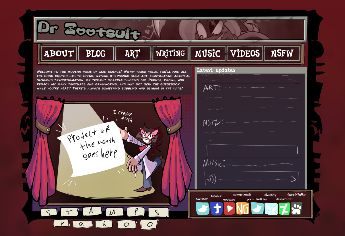
Seeing as I’m an artist and not a web developer, I started the only way I could: I drew what I wanted my site to look like.

As you can see, this concept art of the homepage has had basically all of its features successfully implemented. But while the core concept has been realized, the final page looks quite a bit different than this art. A large part of that difference is readability! Everything here was designed to fit in one small view, but on the actual site, I found I preferred to make things readable while slouched back in my computer chair. I sized things as felt organic, and it ended up larger. This means my site is nowhere near as slick and compact as a lot of NeoCities pages, but meh. I sacrifice style for utility.
In terms of the style and of the site, I started out more edgy (due to being in a depressive mood), but as I worked I found I wanted it to feel vaguely like a pony or furry conventions program book. I was inspired mostly by things like the Ocarina of time UI, Furaffinity, several old school webcomic pages, Adventurequest, and most importantly, Neopets. (Neopets’ art style was already a personal delight, but this project required that I go study it more, and that kind of led to me falling face first into the game. I’ve been hooked all january!)
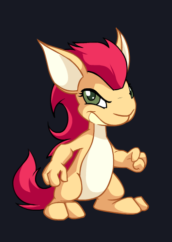
Actually, Neopets is important in another way when talking about site development! After all, you can see in that initial concept that the site was meant to be themed with my signature Blazing Pink (my name for the bright red-pink I enjoy using) and a darker purple… but then when I was looking at Neopets art, I found the steampunk Kyrii.

I color picked this fine lady for the golden frames that now adorn the site, and boy does it work well with the blazing pink. Thank you, oh fuzzy digital beast of wonderful color theory~!
Learning to code!
Learning to code in HTML and CSS was a pretty daunting task at first, but the whole experience has actually been rather enjoyable. Before this, my main coding experience was with Warioware DIY, and also a bit of python I’d used when making the Mod Eater pilot. Now that I’ve spent all this time learning to draw boxes and place images, it’s given me a whole new appreciation for most website’s construction.
Wrapping my head around some of this stuff was pretty difficult! And involved a lot of trial and error. In some places I found it oddly intuitive though. Once I grasped the full enormity of “you can designate anything as a div and then give that div whatever properties” it became a lot easier to understand how to make things look the way I wanted.
I thought I’d have more insightful commentary on the process of learning CSS, but it’s actually been pretty straightforward. Difficult and confusing, yeah, but the process of “google what I’m trying to do and poke around for advice” hasn't been an issue yet… mostly because I haven’t been trying to do anything particularly wild. I’ve been scootin’ around boxes!
Ideas have sat in the back of the brainpan for a while about possibly doing some kind of weird fancy adventure game put together in HTML, inspired by stuff like the old Gorillaz Kong Studios website, or the altador plot on Neopets, but that seems really involved… might still be worth pursuing though! I think it could be pretty entertaining if I find myself with a dearth of other projects…
Site asset showcase
Here’s a look at some of the site's buttons without their text! This isn't really important, it's just cool. I'm particularly proud of the purple one with the stars.


I plan to add to this section as necessary over time.
Mascots
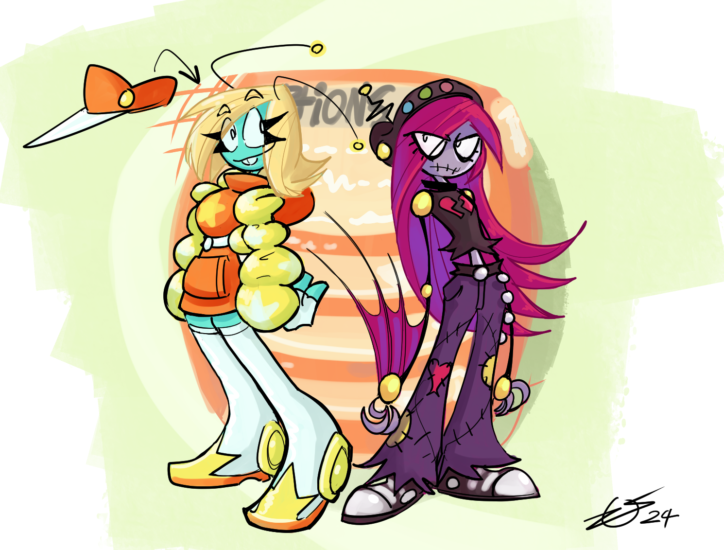
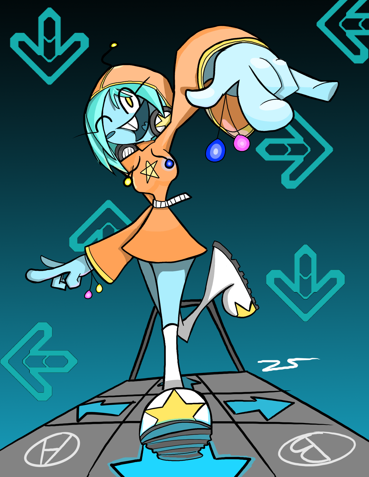
As I was working on the site, I kept thinking it might be fun to have certain pages have cute little art with mascot characters... but I wasn't quite sure who to use! I tried to decide if I should use the Mod Eater characters, or stuff from my larger OC stable... when I realized that I was sitting on a mountain of ancient character designs that had been entombed by time. So, I put on my rubber gloves and went digging through the archives, and picked out two characters to revive. I talked about these two in a blog post in february 2024, but if you're looking for context in the future (and they aren't in the OC guide for some reason), these two are Starcy and Mopebot! Here they are in both their modern redesign'd forms, and in their ancient art!


Scrapped art

This alternate page footer was used for all of five minutes, until I drew the current version. Honestly, there's a lot I like about this one (I bothered to enshrine it here after all), but I wanted something with swirls that more matched the rest of the site's art direction.
Credits
Fonts used on the site:
Marjo regular, from Tinyfactory.org!
Hearts regular, from Tinyfactory.org!
Celestia Redux, made by Mattyhex on DA!
Code used on this site:
The code used to control the randomized banners at the top was stolen and modified from this page's background.
The code used to make my navbar an element that's stored in one place and called in others is taken from this pages helpful guide!
Special thanks!
Sadgrl.online's resources have been instrumental in the construction of this site!
And Neopets, which has possessed my brain with funny animals and whimsy.
